How might we improve the navigation experience of TeleAI?
UX Design UI Design Prototyping Mock-Ups Wireframes Navigation Design
Overview
Scope: Redesign the TeleAI navigation
Users: Heavy machinery operators (primarily at mine sites)
Role: UX/ UI Designer
Tools: Adobe XD, Balsamiq
Insight
The first major project was to update the look of TeleAI to reflect a modern approach to mining. One of the key areas for improvement I identified was to increase the amount of usable area on the screen and decrease space wasted.
Define
Part of redesigning the TeleAI UI to Hard-Line’s updated brand, and to give the software a modern look that fits the competitive landscape and reflects the future of mining.
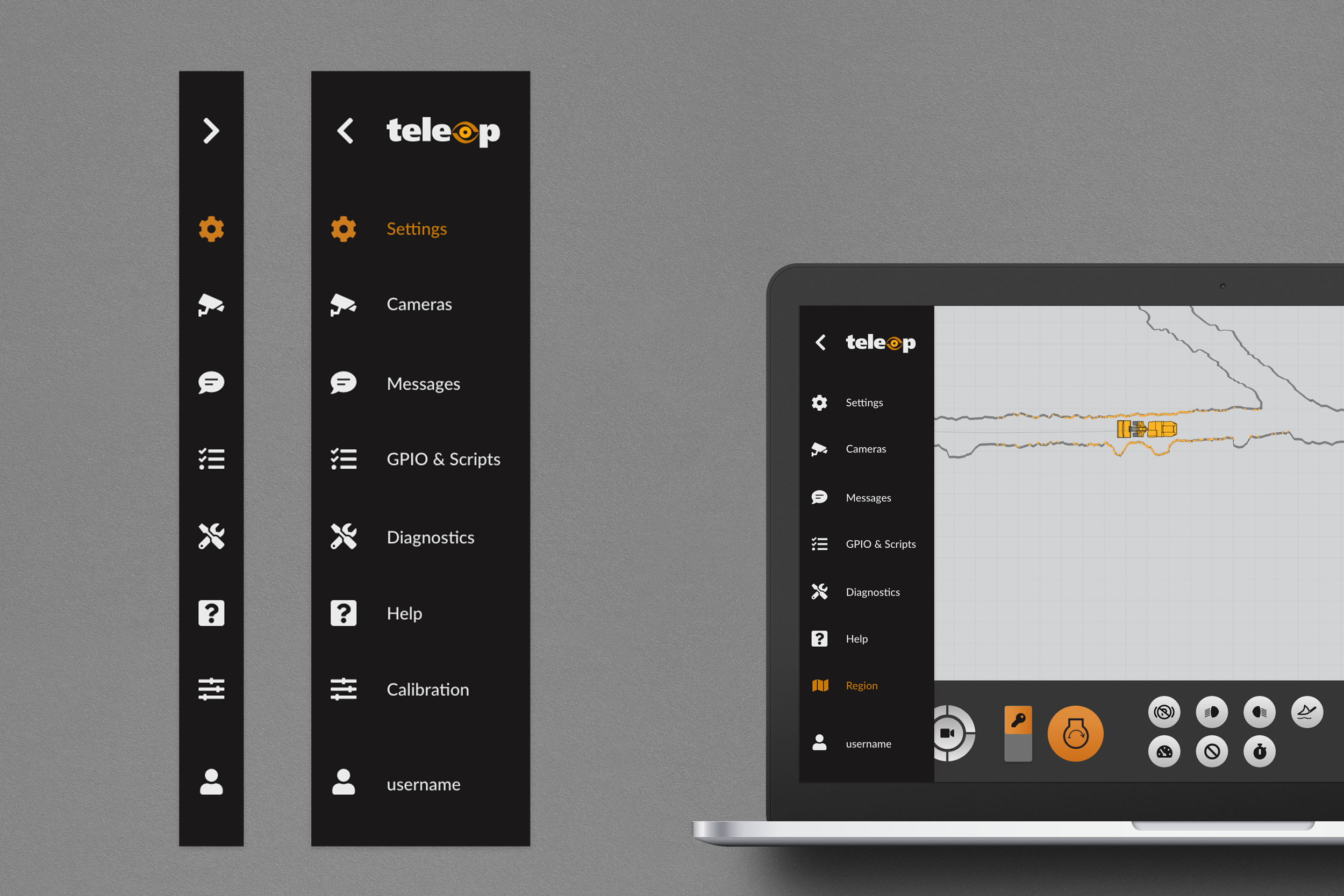
All vehicle configurations have the navigation menu and default screens (settings, security feeds, GPIO, diagnostics, help). The TeleAI system allows different configurations for clients such as Multi (where the user can control multiple vehicles) or Assist and Auto (where users are aided in vehicle control by an autonomous system) but the screen wasn’t designed to make use of empty space when these features were not available.
Process
After ideating and testing different solutions for the navigation menu the menu tray concept was chosen as the best navigation solution, and a component that can be re-used for other submenus, specifically the Auto menu. In the collapsed state the menu tray allows for a reduced footprint when not in use while still allowing users to navigate and access functions. When expanded more information and features that aren't frequently used are visible.

Outcomes
The new navigation menu successfully created more space on the screen for features like the Auto Region view and ARB Grizzly view which greatly benefited users who frequently use those features, but there are other screens that don’t benefit from additional space. There was also some debate around the necessity for the expanded view of the menu with the text displayed alongside the icon. The TeleAI system has been implemented in different language regions and there’s a push towards a more symbol-based system in order to reduce the need for translation. The team settled on the expand & collapse as an intermediary design, however, I’d plan to revisit this feature after adoption to validate whether there is a need for the text and expanded view with usability or A/B testing.